How to Try Hair Colors on Your Photo Before You Dye
Key takeaways
- Use one clear, unfiltered daylight selfie for every shade. Keep your haircut, texture, and lighting as consistent as the tool allows.
- Compare three things separately: how light or dark the color is, whether it looks warm or cool, and whether it is all-over color or highlights.
- Start with a small shortlist: one color close to your own, one lighter or darker option, and one shade you are curious about. Then narrow it to two favorites.
- Check that you still look like you. Discard previews that change your skin tone, facial features, or hair density enough to affect the comparison.
- Save the original and your two favorites for a colorist. Note what you like about the tone, roots, and placement, along with your budget and preferred upkeep.
- A preview cannot predict your dye result. It does not establish lightening needs, a formula, gray coverage, or fading, and it replaces neither a strand test nor the product’s required skin allergy test.
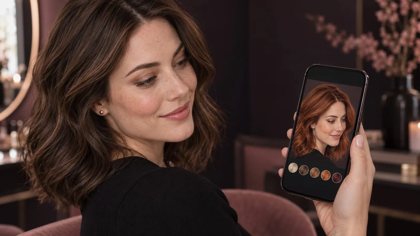
You can try hair colors on your photo before you dye by uploading a selfie to a virtual hair-color app and comparing several shades on the same face. It is a useful way to answer “Would I like myself with blonde, brown, or red hair?” before choosing a salon service or buying a product.
The most helpful result is a shortlist you can explain: “I like the brightness around my face, but I want to keep a darker root.” A color name alone rarely tells the whole story. Honey blonde with a deep root, for example, can look quite different from the same tone applied from roots to ends.
Jump to: the photo workflow · six color ideas · checking your result · the salon checklist.
How to try hair colors on your photo, step by step
1. Take a selfie that shows your actual hair and skin
Face a window in soft, even daylight. Hold the camera at eye level and include your full crown, hairline, and enough of the lengths to see where the color would sit. Let your hair fall naturally; a tight bun gives a color tool very little hair to work with.
Avoid direct sun, colored room lighting, strong shadows, and beauty filters. Those can change the starting color of both your hair and your skin. Choose a simple background and a neutral top so a bright garment does not dominate the comparison.
Keep this original photo. If you usually wear your hair curly, start with your curls visible. A straightened preview with a new color introduces two changes at once.
2. Upload the photo to a virtual hair-color tool
In Get The Look, upload your selfie and explore the available hair-color looks. Check the current options in the app before planning a long comparison session.
Our photo try-on walkthrough explains the broader process. If you are choosing between tools, the hairstyle and makeover app comparison can help you compare the kinds of previews they offer.
Use the same source photo each time. Where possible, keep the length, part, and texture close to your own. If a result also adds a new haircut or glossy blowout, treat that as an extra change when judging the shade.
3. Choose three starting colors
Begin with a shade near your current color, one lighter or darker option, and one bigger change. For a brunette, that might mean chocolate brown, caramel highlights, and copper. For a blonde, it might mean honey blonde, cooler beige blonde, and a deeper brown.
This gives you a useful spread without generating dozens of nearly identical images. Our guide to hair color for your skin tone can help you build the shortlist. Use undertone suggestions as starting points; your own comparison and preferences should decide what stays on it.
If you want to coordinate your hair with makeup and clothing, explore seasonal color analysis at home. Use the palette ideas to choose shades for your photo experiment, then compare the results on your own face.
4. Separate depth, tone, and placement
Once you find a promising direction, change one detail at a time. Comparing a dark brunette with a very pale blonde tells you about a large brightness change. Comparing honey blonde with a similarly light beige blonde is more useful for judging warmth.
| Decision | Compare on your photo | What to look at |
|---|---|---|
| Depth | Lighter versus darker | The contrast between your hair, brows, and face |
| Tone | Golden, neutral, or cooler at similar depth | Which color you enjoy beside your actual skin |
| Placement | All-over versus lighter sections | The root, face frame, and ends |
If warm and cool colors are hard to describe, our undertone guide explains the vocabulary. Keep the lighting fixed while comparing; a warmer photograph can make the hair itself appear warmer.
5. Keep two favorites and label the details
Save your original alongside the best two previews. Under each, write a short note such as “golden pieces around my face, deeper root” or “rich red, less orange than the copper option.” This is more useful at a consultation than a folder full of unlabeled screenshots.
Look again later with your usual glasses, makeup, or clothing in mind. A color you love with a dramatic editorial finish may feel different with your everyday routine. Choose a shade you want to wear, including the upkeep it would involve.
Six hair colors to preview before you dye
These examples cover lighter, darker, highlighted, and red directions. The blonde pair uses one model; the brunette and highlights pair uses another; the copper and burgundy pair uses a third. Within each pair, the face and hairstyle stay consistent so the color is easier to compare.
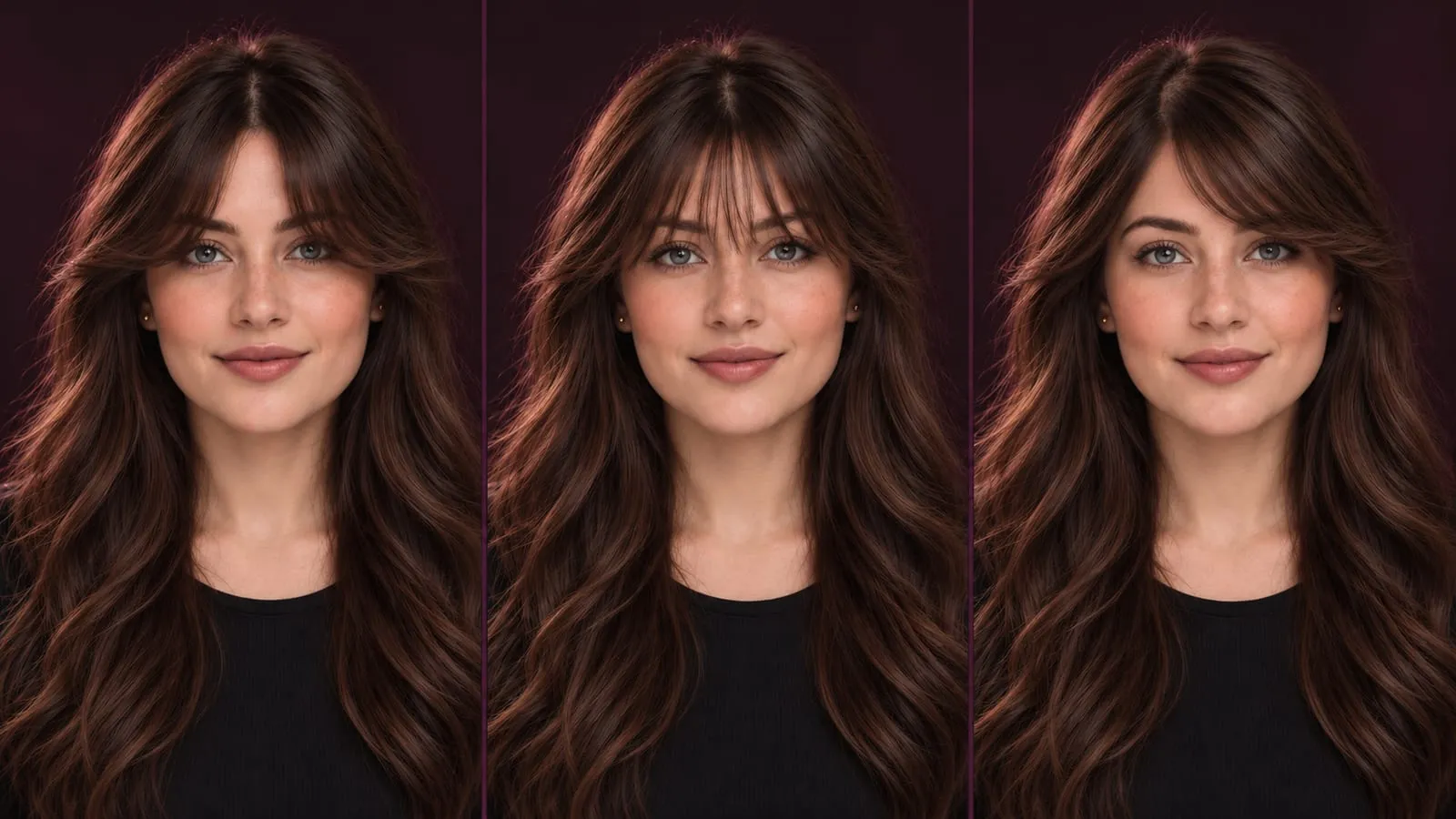
The cover and portraits are AI-generated editorial illustrations of fictional American women. They are color references, not screenshots from the app or real before-and-after dye results.
Honey blonde: try a golden, lighter frame
Honey blonde brings golden warmth into the lengths. Start here if you are curious about blonde but want to compare something softer than a very pale shade.
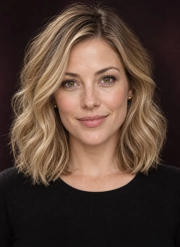
Try honey blonde on your photo →
Look for: how much gold you enjoy around your face, and whether a slightly deeper root gives you the balance you want. Compare the front pieces with the ends; liking a little brightness near your cheeks does not necessarily mean wanting blonde everywhere.
Save this detail: “Warm golden blonde, with some depth at the root.” Your colorist can then discuss what that brightness would require from your starting shade.
Cool beige blonde: compare tone at a similar brightness
A cooler beige blonde is a useful second comparison against honey blonde. The point is to judge a less golden finish while keeping the overall depth reasonably close.
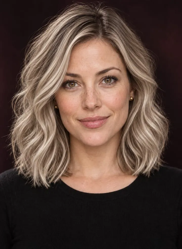
Explore blonde tones on your photo →
Look for: whether you prefer the quieter beige tone beside your skin, brows, and eyes. Check that the preview has not cooled your skin at the same time; that would make the comparison less useful.
Save this detail: “Beige rather than golden, with this amount of root depth.” Avoid relying on “ash blonde” alone, because references using that name can vary considerably.
Espresso brown: see how you feel with more depth
Espresso brown gives you a dark brunette comparison. Look for visible brown nuance and hair texture rather than a flat, solid-black overlay.
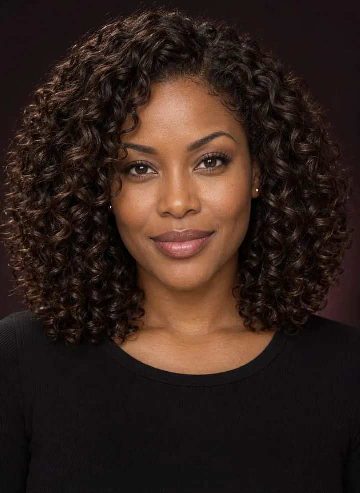
Try espresso brown on your photo →
Look for: the contrast around your face and whether you like the deeper outline. If this feels darker than you want, compare chocolate brown as another brunette direction.
Save this detail: “Deep brunette with visible brown dimension.” Keep your natural texture in view; changing curls to a sleek finish can make the new shine seem more persuasive than the color itself.
Caramel highlights: test brightness without changing every strand
Caramel highlights let you compare a darker base with warm lighter pieces. Notice where those pieces begin and how much color sits beside the face.
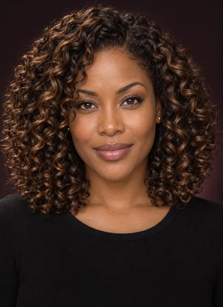
Try caramel highlights on your photo →
Look for: a few lighter curls around the face versus brightness throughout the lengths. Does the darker base still feel like you? Do you prefer delicate ribbons or a stronger contrast?
Save this detail: “Keep the deep root and base, with caramel pieces in these areas.” Caramel describes a color direction; balayage describes a placement technique. Wella’s guide to full and partial balayage explains the difference between broader lightening and selected sections. Ask about placement separately from the shade.
Copper red: try a warm red direction
Copper gives you a more noticeable warm-color change. Compare a vivid copper with a deeper auburn if you like red but want to explore a quieter version.
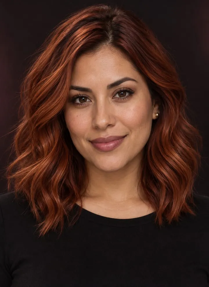
Look for: how much orange-red brightness you like, especially around your cheeks and hairline. A warm glow applied to the whole image can exaggerate the effect, so compare it with your unfiltered original.
Save this detail: “Copper with this balance of orange and red.” If you prefer a deeper reference, explore dark auburn and ask your colorist how the chosen tone would be maintained.
Deep burgundy: compare a richer, wine-red shade
Deep burgundy shifts the red comparison toward a darker wine tone. Beside copper, it helps you see whether you prefer orange warmth or a deeper red-violet direction.
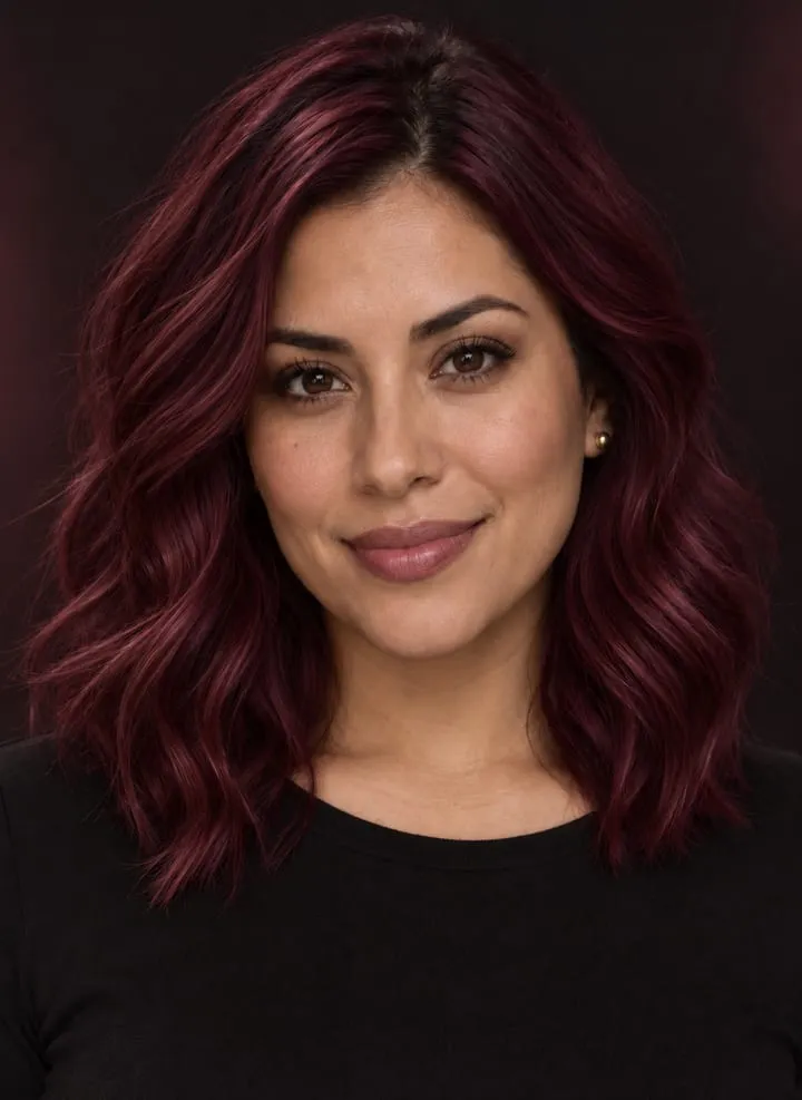
Try deep burgundy on your photo →
Look for: whether you like both the depth and the red-violet tone. If you prefer burgundy, check whether it is the darker appearance you enjoy, the color itself, or both.
Save this detail: “Deep wine red, with this much violet visible.” Bring the actual image, because words such as burgundy, cherry, and mahogany can mean different things across references.
How to tell whether a hair-color preview is useful
Put each result beside the original before deciding that a color suits you. Check these five details:
- Your face: eyes, brows, nose, jaw, expression, and skin tone should remain recognizably yours. A flattering face edit can distract from the hair comparison.
- The hairline: look for color painted onto the forehead, ears, or background, and for uncolored strands left near the part.
- Your texture: curls, waves, and density should be plausible for your hair. Added volume or a smoother finish introduces another variable.
- The placement: an all-over color overlay cannot reliably show a subtle root blend or individual highlights. Save a separate placement reference if the preview simplifies them.
- The lighting: keep screen brightness consistent and avoid judging one image with a warm display mode and another without it. A screen image is still an approximation of real hair.
Try viewing your favorites as small thumbnails as well as full-size images. The thumbnail shows the overall frame around your face; the larger view helps you spot editing problems. If a tool repeatedly changes your face or loses your hair texture, try a clearer source photo or use the result only as a loose color reference.
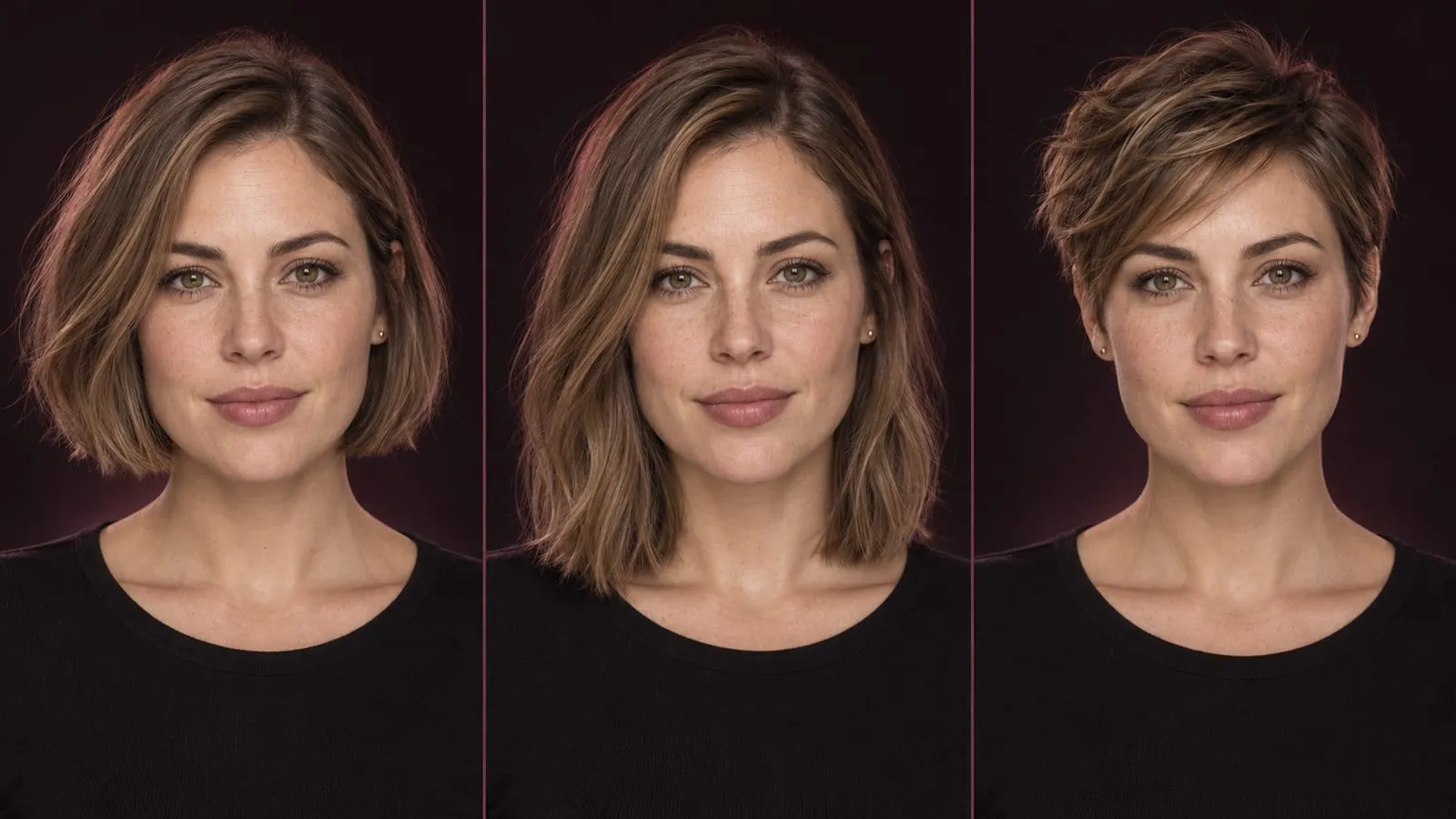
Keep a haircut decision separate, too. If you are also considering a bob or pixie, use our short-hair preview guide after choosing a color direction, or test the cut first with your current shade.
What to check before you dye your hair
A virtual preview helps you choose an appearance. Your real hair determines how a colorist can work toward it. Bring your original, two favorites, and a reference showing any highlights or root blend you want.
Ask about:
- Your starting point: natural roots, existing dye, gray strands, and previous lightening or other chemical treatments.
- Achievable brightness: whether the goal needs lightening, multiple appointments, or a different first-step shade.
- Placement: all-over color, selected highlights, the face frame, and how much of your original base remains.
- Regrowth and fading: what you should expect between visits and which refresh services or home care would be needed.
- Time and cost: the initial service and the routine you would be committing to afterward.
For a concise salon brief, try:
“I like this preview because of the [depth, tone, or lighter pieces around my face]. I want to keep [this root depth or this much of my base]. Here is my original photo and my color history. What is realistic for my hair, and what would the upkeep cost?”
Before using dye, follow its instructions, including the required skin allergy test. The FDA recommends following package directions and patch testing each time you dye. A strand test has a separate purpose: checking a product’s color result on actual hair, as Clairol’s preparation guide explains. A digital image cannot perform either test.
Start with your favorite two photo previews and a clear description of what you like. That gives you a useful conversation to take into the salon—and a better basis for choosing a color than one attractive photo of someone else’s hair.
FAQs
- How can I try different hair colors on my photo?
- Take a clear, unfiltered selfie in even daylight, then upload it to a virtual hair-color tool. Compare a few shades on that same photo while keeping the cut and texture close to your own. Check each result against the original for changes to your face or skin tone, and save two favorites to discuss with a colorist.
- Can I see what I would look like blonde if I have dark hair?
- Yes. A photo preview can help you compare the appearance of honey, beige, or brighter blonde around your face. It cannot establish whether your current hair can reach that shade in one appointment, whether lightener is needed, or which formula to use. Show a colorist your original photo, preferred preview, and previous color history.
- How accurate are virtual hair-color filters?
- They are useful for comparing a color direction, but the result depends on the tool and your photo. Lighting, edited skin, missing strands, and changes to hair density can make a preview misleading. A filter does not predict dye absorption, gray coverage, fading, or the exact shade your hair will achieve.
- Can I try balayage or highlights instead of an all-over hair color?
- Yes, if the tool offers those looks. Compare a reference with a deeper root and lighter sections against an all-over shade at a similar brightness. Check where the light pieces begin and how much of the front is highlighted. A single-color overlay may not show placement accurately, so bring a separate reference to your colorist if needed.
- Can a hair-color preview show how dye will cover my gray hair?
- A preview may show an overall color or a possible blended look, but it cannot confirm how a particular product will cover your gray strands. Keep an unfiltered photo that shows your roots and ask your colorist to compare full coverage with blending, including the regrowth and maintenance each approach would involve.
- Do I still need a strand test after using a hair-color app?
- Yes. A digital preview changes an image; it does not test a product on your hair. Follow the product instructions for a strand test and the required skin allergy test before use. The strand test checks the color result on actual hair, while the skin allergy test serves a different purpose. A preview replaces neither.